No warming, no worries, no windmills

caption

The Freedom Clock shows nearly 20 years without global warming

Christopher Monckton thoughtfully keeps us acquainted with some essential moving targets on the climate change range. One monthly chore he undertakes is to update the RSS global mean temperature at Watts Up With That and (the neat part) find out whether the pause has got longer. It usually has. This is from his latest post a week or so back. Continue Reading →

Visits: 250

Curiously connected temperatures

Australia and NZ are closer than we thought

Source: New Zealand hottest ever day in February 1973 arrived directly from Australian heatwave | Errors in IPCC climate science

Warwick Hughes came across the highest temperatures recorded in New Zealand and found that they occurred just as a Sydney heatwave came to an end. Continue Reading →

Visits: 83

NIWA’s data proves NZ warming halt

It’s getting worse than they thought (for them!)

NZ monthly temperature anomalies 2001-2012 from NIWA reports

This insight into the NZ temperature record is from the resourceful Bob D. I’ve promoted it because it’s priceless. Bob says:

NIWA’s Climate Updates

I thought I’d share the local New Zealand temperatures over the last decade. I downloaded all NIWA’s Climate Updates from their website (the first one I could find was Oct 2001) and plotted the temperature anomalies that were published for each month.

Of course, what with Catastrophic Anthropogenic Global Warming and all, I expected to see temperatures rising (accelerating, even) in a wild, out-of-control fashion, as the water vapour feedbacks kicked in, tripling the initial warming that came from the gigatons of poisonous carbon dioxide pollution that we’ve spewed (spewed, I tell you) into the atmosphere over the past decade.
/sarc

I was a little surprised at what I saw. Continue Reading →

Visits: 374

Sciblogs ignores climate facts

Talk about spin.

Greenpeace went in to bat for the seabirds killed off by a bit of oil from the Rena – good on them. But they had a big, juicy agenda – killing off deep sea oil drilling near NZ. So they exaggerated the few Rena bird deaths. The 1300 little bodies collected became 20,000 dead, without evidence to justify the expansion.

Then they claimed that 1000 times more again “could” perish in a spill the size of the Gulf of Mexico disaster. That would mean 20 million dead birds. Well, that was ambiguously tentative, although they said later they weren’t talking just about bird deaths.

Our good friend Bryan Leyland complained to the Advertising Standards Authority over Greenpeace’s wild claims. The ASA agreed with him, saying Greenpeace made misleading claims and really shouldn’t. Continue Reading →

Visits: 75

Climate change frauds unacceptable

micrometer

Don’t tolerate the nonsense

I’ve been reading about famine in East Africa – the Great Horn of Africa, after its well-proportioned resemblance to the rhino’s horn. The Horn (nowhere near Cape Horn, bottom of South America) includes names iconic for armed insurrection and starvation: Sudan, Eritrea, Djibouti, Ethiopia, Somalia, Uganda, Kenya, Mogadishu, Tanzania, Rwanda and Burundi.

East Africa is a fascinating study in its own right. The region has been subject to irregular cycles of feast and famine for thousands of years, so it’s rich with a theme much used by global warmers.

At any sign of a starving child someone can be relied upon to blame the situation on “climate change” and therefore on we wicked, wasteful westerners, never mind that not every drought causes a famine (not by a long shot) and corrupt or weak African politicians play a much stronger role in disastrous famines than climate does.

Anyone describing climate and consequent food security these days finds it necessary to refer to “climate change” and hence venture on to the IPCC tightrope strung up for global warming believers everywhere. When that happens, they quickly wobble and fall off; one just has to wait a bit.

So it proved in this research into famines in the Horn of Africa. Continue Reading →

Visits: 426

NZ temperature record — it’s worse than we thought

Thanks to those who advised me of this amazing email from the Climategate 2 collection, either through comments here or private email. It concerns the pre-1930 cooling of the New Zealand temperature record, and makes food for thought, especially for those supporting NIWA, Salinger and the increasingly shaky AGW story. Although it’s more of a novel, and a bad one at that, with gaping holes in the plot and evidence so carelessly thrown together it fools nobody. Now, as many of us feared was the case, comes evidence that the NZ temperature record has been applied to far more places than where it was observed. We now know it was stretched over far-flung places it was never intended to go. This is the worst result possible.

Cc: t.osborn@uea.ac.uk
date: Mon, 7 Sep 2009 00:13:56 +0100 (BST)
from: “Tim Osborn”
subject: New Zealand summer temps
to: p.jones@uea.ac.uk

Hi Phil,

just a quick Q before I go to bed!

I’ve just updated the IPCC paleo chapter Southern Hemisphere plot where we
showed, amongst other things, Ed Cook’s New Zealand TRW reconstruction,
with CRUTEM2v Jan-Mar smoothed temperatures.

For my update I’ve used CRUTEM3v, expecting them to be rather similar but
with a few more years on the end.

But the pre-1930 temperatures are now very different, being much cooler
(by > 0.5 degC for a 25-year low-pass mean) in CRUTEM3v than CRUTEM2v.
Previously they had been, on average, near or even above the 1961-1990
mean, now they’re at -0.5 degC.

Is this a result of some homogenization work on New Zealand summer temp
data? Or just some random artefact of minor changes somewhere?

Cheers

Tim

— Dr. Tim Osborn RCUK Academic Fellow Climatic Research Unit School of Environmental Sciences University of East Anglia Norwich NR4 7TJ, UK www.cru.uea.ac.uk/~timo/

Visits: 496

More about the NZ temperature record

Errors in the new 7SS

The shocking breakthrough in our audit is that NIWA didn’t use the adjustment method they said they would use. Barry Brill, chairman of the Coalition, released an overview entitled New Zealand Unaffected by Global Warming (pdf, 1.3 MB). The discovery that the country hasn’t experienced global warming is another startling finding. In Chapter 8, on page 24, he identifies nine criticisms of NIWA’s newest 7SS. These multiple defects destroy the credibility of the 7SS as a source of the NZTR. Continue Reading →

Visits: 121

A case of the blind leading the climatologists

the blind leading the climatologist

There has been no significant global surface warming this century, yet experts say that temperatures rose during the first decade, becoming seriously hot. Hotter than ever before, in fact. For example:

January 21, 2010:

Past Decade Warmest on Record, NASA Data Shows

The decade ending in 2009 was the warmest on record, new surface temperature figures released Thursday by the National Aeronautics and Space Administration show.

The agency also found that 2009 was the second warmest year since 1880, when modern temperature measurement began. The warmest year was 2005. The other hottest recorded years have all occurred since 1998, NASA said.

James E. Hansen, director of NASA’s Goddard Institute for Space Studies, said that global temperatures varied because of changes in ocean heating and cooling cycles. “When we average temperature over 5 or 10 years to minimize that variability,” said Dr. Hansen, one of the world’s leading climatologists, “we find global warming is continuing unabated.”

But the only thing continuing “unabated” is the linear trend line — it’s still going up, and its slope hasn’t changed. “It’s all right. Only the data show a decline.” Continue Reading →

Visits: 1100

Does this destroy sceptical arguments?

This is surely too good to be true for the warmists.

In the last few days of a failing international conference, here’s a paper carrying strong confirmation of global warming. It’s not attribution, of course, but nobody will notice that. Proof of warming is enough to tweak the guilt nerve.

The Washington Post says:

The global temperature series is one of the clearest pieces of evidence that the planet is heating up. Over the past century, it’s easy to see from, say, NASA’s data that surface temperatures have risen dramatically. But there’s also a fair bit of short-term natural fluctuation from year to year, which can sometimes obscure what, exactly, is going on.

Continue Reading →

Visits: 83

Simple test shows sulphates not cooling

There is no statistically significant warming trend since November of 1996 in monthly surface temperature records compiled at the University of East Anglia. Do we now understand why there’s been no change in fourteen and a half years?

Well, yes, because “blame” for this interruption in warming has been placed on sulphates emitted by China’s power stations zealously burning coal. Hasn’t it?

Has this hypothesis been tested? No. Can it be tested? Yes.

Most of the aerosols are in the northern hemisphere, and there’s little mixing of air between the hemispheres. Reason tells us that the northern hemisphere should be cooling and the southern hemisphere should be warming.

Well, go on, this is the big test, look it up. Continue Reading →

Visits: 56

NZT7 uses defective raw data

Albert Park 1902 looking south

The official New Zealand Temperature Record is made up of historical temperature readings (raw data) and NIWA’s adjustments. Both of those components are unreliable.

The 169-page Report on the Review of NIWA’s “Seven-Station” Temperature Series, or the Review Report (RR), published by NIWA in December 2010 devotes very little space to that bane of climatologists — the urban heat island (UHI) effect. It has been long recognised that air temperature readings taken in towns and cities are affected by the heat absorption of concrete and tarseal surfaces; by exhausts of vehicles, aeroplanes and air-conditioners; and by structures which deflect wind and confine humidity.

Because a “heat island” is not representative of the wider region or country, most climatologists try to give them a wide berth. Wikipedia says that “the temperature difference between urban areas and the surrounding suburban or rural areas can be as much as 10°F”.

A similar enemy of the climate archivist is “shelter” — trees or structures which interfere with the thermometer’s normal exposure to wind or sun, and thereby cause distortions.

The mean temperature impacts of both UHI and shelter are typically gradual, but non-linear. They are hard to detect and almost impossible to correct. Most climate archivists simply omit any sites suspected of being contaminated by UHI/shelter. Continue Reading →

Visits: 75

NIWA bible

the Bible

Rhoades & Salinger (1993)

The late Michael Crichton declared that ‘global warming’ had become a religion, with the IPCC reports comprising its bible. The central dogma of the religion rests on the global temperature record, which ‘proves’ recent global warming. It has a bible of its own, largely written by CRU’s “hockey team” — those conniving, partisan, anti-sceptical scientists of Climategate infamy.

Above and beyond everything else it might be, a bible inspires belief. That is the natural result of the veneration a bible gains by long use. And you don’t ignore something you venerate.

Around the world amateur, unpaid investigations reveal that recent warming trends don’t really exist. In fact, they are largely created by “homogeneity adjustments” to the actual thermometer readings. Continue Reading →

Visits: 40

NZ temperature record – a brief history

mountain mists

Official temperature records have been maintained in New Zealand since shortly after European settlement began in 1840. Throughout the ensuing 150 years, mean temperature levels appeared to remain stable. But NIWA (the responsible Government agency) has recently questioned the historical record, suggesting a long-term warming trend may have been hidden in the data.

Publications from 18681, 19202 19603 and contemporary records4 indicate that mean temperatures in New Zealand cities have not significantly changed since records began (Tables 1,2,3). Degrees Fahrenheit in the early figures have been converted to degrees Celsius. Continue Reading →

Visits: 2410

More proof global temps lag SOI

SOI forecast January 2011

NIWA, listen to this, it’s amazing

UPDATE 1, 11 JAN 2011, 09:30 NZDT

On December 1 last year, we wrote about Bryan Leyland’s prediction of significant cooling before the end of the year coming true. You can see from the chart exactly what happened. Not only that, it would appear that the temperature has not finished going down yet.

This remarkable forecast, now some eight months old, comes out of a 2009 paper showing a lagged correlation between global temperatures and the Southern Oscillation Index (SOI), calculated from fluctuations in the air pressure difference between Tahiti and Darwin, and indicative also of the start (and the state) of a La Nina (as now) or an El Nino. This correlation is a lot more convincing than comparing global temperature with CO2 levels! Continue Reading →

Visits: 99

NIWA generating warmth

NIWA temperature adjustments, before and after

— by Barry Brill, Chairman of the New Zealand Climate Science Coalition

This graph summarises how NIWA’s recent adjustments to the historical temperature data has created a 20th century warming trend of 1.0°C. There were 22 changes in the period 1900-75 and almost all of those adjustments went downwards. Over 90% of the adjusted station-years moved in the same direction – a very surprising result.

Another curious aspect of the NIWA adjustments is that their amplitude is almost directly proportional to their chronological age. The further back one goes from 1975, the larger the adjustment becomes. Continue Reading →

Visits: 69

Discredited graph flourishes still

NZ annual temperature series

On NIWA’s web site their discredited graph of New Zealand’s temperature history still clings to life. Look at it — it seems to flutter its wiggly lines, hoarsely whispering: “believe me, believe me.”

This is the graph NIWA’s lawyers completely disown in a declaration to the High Court that it is “not an official graph.”

Why do they continue to display it? It lacks any kind of scientific justification or integrity. The main authority describing its methodology has never been cited, never been copied, never been peer reviewed.

None of the seven weather stations (only seven for the whole country, out of hundreds?) showed significant warming in their raw readings. But six have had a “temperature rise” imposed by adjustments, 90% of which served to create warming.

Have NIWA no shame? They should have withdrawn this spurious piece of scientific chicanery months ago. Instead, it remains there to lie to our children.

We’re still waiting for the new version, reviewed by the Australian Bureau of Meteorology, promised by NIWA last March. Will we see it before Christmas 2010? When we finally do see it, will it still show nearly a degree of warming over the 20th Century?

If it does, how will they justify that? If it doesn’t, how will they face their public, for what will happen to their claims of anthropogenic global warming?

There’s a great deal hanging on the new version of this innocent-looking graph. And I mean “hanging.”

Visits: 81

Temperature adjustments science or art?

a beautiful iced-up waterfall

Barry Brill rips into NIWA’s showcase paper on the Hokitika weather adjustments — the one intended to demonstrate that data adjustment is science rather than art.    – Richard Treadgold

— by Barry Brill, Chairman of the New Zealand Climate Science Coalition

In February 2010, NIWA published a showcase paper titled Creating a Composite Temperature Record for Hokitika, offering details of adjustments it made to the NZ Climate Database for the Hokitika Airport weather station — one of the “Seven-station Series” (7SS) which makes up the official New Zealand temperature record.

The NZ MetService measurements for Hokitika cover the 20th century and display no significant linear trend up or down. The temperature recorded here in 1900 was 11.8°C, while 2008 was 11.93°C, and the 30-year average from 1971–2000 was 11.74°C.

The NIWA-adjusted version, on the other hand, shows a linear warming trend of 1.3°C, largely brought about by downward adjustments in the Hokitika temperatures in the first half of the century. The justification for those adjustments has been cited repeatedly as being an Appendix to a university thesis submitted in 1981 (see “The Salinger Thesis”).

NIWA temp adjustments with scales of justice

The Hokitika details were made public as a worked example of the adjustments that NIWA has made to all seven weather stations in the 7SS, in consequence of the Salinger thesis. Accordingly, the credibility of the entire project stands or falls on the strength of reasoning advanced for the Hokitika alterations.

But that reasoning is not sound. Continue Reading →

Visits: 101

Seventy years is plenty

Unadjusted NZ temperature history

Barry Brill makes a strong case for the New Zealand temperature record to ignore the period before 1930. In essence, he says that a 70-year-long record is plenty long enough to establish a trend, and in any case the early data is either missing or unreliable — just chuck it out! He says it at greater length and more politely than that in a sometimes tongue-in-cheek article that makes sly digs at NIWA for the mistakes or naked bias that have given us a deeply suspect temperature “history.”    – Richard Treadgold

— by Barry Brill, Chairman of the New Zealand Climate Science Coalition

Climate Change policy is driven by forecasts of temperatures over the next 100 years. But the computer models need to be checked against the actual temperature trends of the last 100 years. If back-casts are wrong, then fore-casts will also be wrong.

The NZ temperature record averages seven weather stations — Auckland, Masterton, Wellington, Nelson, Hokitika, Lincoln and Dunedin — through the twentieth century. But there are many gaps and flaws up to about 1930 and, apart from these seven, there are very few other records to use as benchmarks.

First 30 years a chequered history

Auckland: Moved from the Museum to Albert Park in late 1909, and was affected by rapid tree growth and urbanisation during the next 20 years. Continue Reading →

Visits: 358

Lincoln – a comedy of errors

classic tragi-comic masks

It would be easy to overlook this little paper, but don’t be tempted! In the context of “NIWAgate”, our legal move against NIWA and world-wide action to clarify temperature records which seem to bolster claims of unprecedented warming, Barry Brill’s revelations are dynamite! We asked NIWA what changes they made and why. NIWA said we’d find it in certain papers. Now, for the first time, Barry shows decisively that those papers don’t contain either the changes or the reasons they were made. NIWA’s duplicity is indisputable. Is this the behaviour we want from our premier climate research agency?   – Richard Treadgold

— by Barry Brill, Chairman of the New Zealand Climate Science Coalition

The weather station at Lincoln is one of the seven which make up the official NZ Temperature Record over the past 100 years. It shows a strong warming trend as a result of downwards adjustments which NIWA made in respect of the pre-WW2 period. But those adjustments rely upon a curious methodology which is not supported by any of the peer-reviewed literature.

The original temperature data for the Lincoln weather station – recorded by the NZ MetService, and now downloadable from NIWA’s official Climate Database – shows no warming trend over the past 100 years.

More adjustments that cause warming

The Schedule of Adjustments (SoA) prepared by Dr Brett Mullan and posted on the NIWA website on 9 February 2010, shows five downwards adjustments in the period 1881-1943 and two upwards adjustments during 1944-75. All seven alterations to the NZ MetService climate database are trend-favourable, and comprise the sole source of the reported warming trend. Continue Reading →

Visits: 379

Hansen refuses to explain why he does it

Dr James Hansen

While on the subject of awkward, unanswered emails, let me pass on a message I recently sent to Dr James Hansen, the scientist widely famed as the “father” of global warming. I still hope he will offer some explanation.

4 March 2010

Dear Dr Hansen,

The Climate Conversation Group and I have become interested in the very meaning of “taking the temperature”, calculating the so-called “average” temperature for a place and a region and the meaning of doing so. I have just seen your web page [The Elusive Absolute Surface Air Temperature (SAT)], discussing these and related matters. It is an interesting and informative page.

You say there is no agreed method of measuring surface air temperatures and, in fact, there are numerous practical and theoretical obstacles to ever achieving such a measurement.

There is a very obvious question raised by that discussion. We are interested to know why, if it cannot be done, do you do it?

Regards,

Richard Treadgold
Convenor
Climate Conversation Group

Visits: 361

Up down all around it ends where it begins

A Mobius strip

Most people take for granted that New Zealand’s surface air temperatures (SAT) have gone up over the last century. But is that true?

NIWA’s official graph of the national temperatures is well known. You can get it from their web site. By the way, if you go there, let me know if you think they’ve recently stretched the image laterally; it is definitely wider than before — even the text is obviously stretched sideways. Could they be trying to make the vertical change less prominent and thus reduce the apparent slope of the trend line? What goes through their minds at NIWA? Anyway, as copied a few months ago, and so a little different, it looks like this:

NIWA's official NZ temperature graph

You should be aware that the Climate Conversation Group and the NZCSC have delivered a rip-snorting criticism of this graph, so we don’t agree with it even for a moment. Now I will raise further objections to NIWA’s graph because it contains features inconsistent even with NIWA’s own conclusions. Continue Reading →

Visits: 358

Impressively complex. Of course, we ignore it — NIWA

A Stevenson screen in the snow

NIWA keep talking about various reasons to adjust the official New Zealand temperature readings. They say one must account for changes in location, exposure, urbanisation and instrumentation. For some reason they continually harp on about the altitude difference between Thorndon and Kelburn (Wellington).

But it is empty talk, because they have never made changes for those reasons. Are you listening? People of New Zealand: scientists from the National Institute of Water and Atmospheric Research (NIWA), your country’s publicly-funded, premier environmental research organisation, have lied to you and continue to lie to you. Continue Reading →

Visits: 363

Salinger & NIWA all at sea over temperature trends

NZ temp record

What’s going on?

NIWA goes to a lot of trouble to warn us about the coming “climate change” causing warming between 0.7°C and 5.1°C by 2090. But I can reveal evidence that our top climate scientists don’t believe this.

Should New Zealanders expect significant warming for the next 80 years? You might be surprised to learn — especially if you’re following the discussions here — that scientists with NIWA, whose job is to research the climate, tell us we already haven’t had any warming to speak of for about 60 years and we won’t get serious warming in the future.

Now that’s not the message we normally get from government scientists! Continue Reading →

Visits: 445

NIWA loses, opts for fresh start

NZ temperature icon

Regular readers will know that we asked NIWA how they adjusted the NZ temperature series. In reply, they distracted, deceived and disparaged us. We checked what they told us and it was false. They lose.

They admit they never had the temperature adjustments we were asking for. Why didn’t they just say so in the beginning? We and the NZ public await an apology for their dissembling.

They’ve done the hard thing and admitted the truth. So the good news is they can now get on with some real science. They say they will “recreate” the adjustments. Whatever they mean by that, it must be an improvement on trying to denigrate us when we ask for information. It is also good that they reexamine the 30-year-old claims of warming that wobble now they lack any scientific support. In fact, there is evidence they are false. More on that later. Continue Reading →

Visits: 518

NIWA guilty of propaganda posing as science

NIWA web site banner

NIWA (National Institute of Water and Atmospheric Research) has been accused of “propaganda posing as science” in its claim that the 2000s have been the warmest decade on record. The New Zealand Climate Science Coalition says the claim that the “noughties” decade is the warmest is based on a statistic for which the margin of error is far greater than the claimed warming.

The Coalition says it fully agrees with the criticism by Blue Skies weather forecaster Tony Trewinnard that NIWA’s own numbers show there is no long-term warming trend.

The warm decade claim is one of five by NIWA which amount to advocacy rather than science, and as such represents propaganda which should not be expected from a Crown research institute, especially one claiming to be based on science. The examples of advocacy are:

1) The warmest decade: NIWA principal climate scientist Dr James Renwick told newspapers that temperatures at seven key stations over the past 10 years were one-tenth of a degree above the 1971-2000 norm, adding “the next warmest were the 1980s, about 0.07°C above that normal, so it’s only a few hundredths of a degree difference”. Dr Renwick should know that a few hundredths of a degree is well inside the margin of error for temperature readings and is, therefore, meaningless. The Coalition says if Dr Renwick doesn’t know about margin for error he shouldn’t be in the job; and if he does know it, he has misled the public.

2) NIWA constantly claims that spot temperatures are just ‘noise’ and only long-term trends are important in climate science. NIWA’s statement notably fails to mention that the upward trend in the nineties has unexpectedly disappeared in the ‘noughties’.

3) Most of the warming in New Zealand occurred prior to about 1955, well before the build-up of atmospheric CO2. There has been little or no statistically significant warming in New Zealand over the past 55 years. NIWA fails to put its information in its proper context.

4) Climate is always warming or cooling. There no evidence whatsoever that ‘climate change’ in New Zealand over the past 150 years is outside the expected range of normal climate system variability.

5) The NIWA press statement wrongly contended that 2009 was a year of warm weather extremes, when it is usually at pains to distinguish weather from climate. It dwelt on cyclones in the Pacific without mentioning the vanishing hurricanes in the Atlantic. It studiously avoided mention of the blizzards which disrupted the Copenhagen conference and are currently setting coldness records throughout the Northern Hemisphere. The entire piece is a classic example of the use of selective and misleading data.

The Coalition statement concludes: “Until NIWA responds to our request to come clean on the full extent of its adjustments to raw temperature data, exactly what adjustments were made, and why, any statement that institute makes about climate variation must be taken with a grain of salt.”

Visits: 69

No assistance from NIWA

A mound of email arrived in my inbox over the last few days. Much of it relates to our attempt to get from NIWA the actual adjustments they have made to the national temperature record.

My first priority is to make an informal response to NIWA’s posts on their web site and to the parliamentary answers we’ve received. It’s important that the people who have trusted NIWA know just how they are pulling the wool over our eyes (or trying to) and refusing to cooperate. In fact, they are being far more obstructive than any publicly-owned utility has a right to be, and you deserve to hear the details of it.

A scientific study is under way right now to make a more formal response to NIWA’s obfuscation, but that won’t be finished until some time in the New Year.

My thanks to everyone who has contributed information or suggestions, but their sheer number means it’s taking longer to review them. Which means I’m also unable to follow up for now the new connections we’ve just made with the network of Climate Realists, run by the excellent Neil and Esther Henderson, of Gisborne. But we’ll get there!

The new interest in us, but more importantly in the evidence-based doubts about the truth of dangerous man-made global warming, is wonderful.

So that’s the reason I haven’t posted anything about NIWA’s completely inadequate answers to us. But it will come soon.

Visits: 346

NIWA squirms, but agrees to release adjustments

A momentous meeting took place last night (Wednesday, 9 December) at Parliament House in Wellington. This exclusive account comes courtesy of the Hon Rodney Hide, who was present.

The meeting was called two weeks back by Nick Smith so that MPs could be briefed by Dr David Wratt, Chief Climate Scientist, on the official NZ temperature graph published by NIWA on their web site, which Rodney Hide had posed questions about in the Parliament.

Knowing NIWA climate scientists would be there, Rodney invited Dr Vincent Gray, leading climate scientist, to accompany him as an advisor.

Gross discourtesy

But before the meeting could begin, the Hon Dr Nick Smith had a surprise for them. He ordered Rodney not to bring Vincent into the meeting. Nick said roughly: “It’s a private meeting of MPs and we do not wish to have outsiders.” But, showing a distinct favouritism, he allowed the outsiders from NIWA to remain. So why did he exclude Rodney’s adviser? Was it because Vincent has known the details of the New Zealand temperature records for more than fifty years? Was NIWA afraid of what he knows? If not, why did Nick Smith refuse to admit Dr Vincent Gray?

It was, of course, a gross discourtesy for Nick Smith to brusquely issue orders to a coalition partner in front of other MPs. But that’s just my opinion.

So Vincent Gray took his leave and subsequently Dr Wratt began his address. They sat through about 25 minutes of a description of the IPCC process, its committees, scientific writers and review procedures. David talked about the climate modelling that underpins the alarming climate predictions and it was quite unnecessary and very boring.

Sudden disorder

Finally there was a moment for a question. Rodney said: “I’d just like to take you back to the graph on your web site, the one with seven stations. Can I ask about that?”

There were sudden signs of disorder as David Wratt, with the other scientist (Rodney didn’t catch his name) interrupting from time to time, seemed immediately to become angry with the New Zealand Climate Science Coalition. He ranted on about their press release and they didn’t want to know this or that. Continue Reading →

Visits: 343

Salinger’s adjusted data now online

By courtesy of Mr Warwick Hughes, who kindly sent it to us, we are pleased to post this spreadsheet containing the historical New Zealand temperature series. The data are from the seven weather stations chosen by Dr Salinger and adjusted by him to represent the country’s temperatures, although it does not include the actual adjustments made or the reasons for them.

When plotted, it produces a graph similar to the one on NIWA’s web site that shows strong warming during the 20th century.

Go to Files, above

See more information and download the spreadsheet.

Just download the spreadsheet.

Visits: 341

Wratt’s prediction falsified already — by his own graph

A funny thing happened last week involving Parliament but almost nobody noticed. Without my observant scientist friend, I wouldn’t know about it. We’re all pretty lucky that he put two and two together, but that’s what scientists are good at. He tells me they practise putting them together three or four times a week and some of them are so good at it they have trouble getting them apart.

So what happened? First, our study appeared, with a copy of the official NZ graph showing strong warming over the last hundred years. Second, Nick Smith said NIWA tells him New Zealand’s global warming will be much milder than elsewhere. Can both statements be true? Only if our steep temperature rise suddenly slows right down! It’s another mystery. Continue Reading →

Visits: 329

Supplementary Information – Hokitika

Are we feeling warmer yet?

NZ Climate Science Coalition & Climate Conversation Group
30 Nov 2009

A number of people have now asked us for the raw data we used to create the unadjusted versus adjusted temperature graphs in our study Are we feeling warmer yet? We will shortly post a list of station names from the NIWA CliFlo database. While we could post the data directly, it would be fairly pointless, as you would need to know in detail the weather stations and the methods we used to combine them. Each station required some experimentation and detective work, assumptions had to be made and we may well have made errors. We make no claim to be infallible, so we publish these notes to let the reader judge whether our study has merit.

We will shortly be making the Salinger adjusted dataset available. We would like to thank Warwick Hughes for providing us with that data.

In this document we want to work through an example weather station—Hokitika—to illustrate our approach and methods. We also want to address NIWA’s response, currently on their website, that the Wellington adjustments are justified by altitude differences between stations where no time series overlap is available (Thorndon, Kelburn and Airport). The assumption is made by NIWA that stations can be adjusted together in such cases (even though they have no common overlap period and are also separated both spatially and temporally) as long as they share a common height above sea level.

By giving examples of stations with both altitude separation and an overlap period, we show that the lapse rate can differ and even the sign of the temperature difference can be reversed. Some higher stations record warmer temperatures than nearby lower stations. Therefore, it is invalid to move two station records together simply because they share a station height.

Go to Supplementary Information — Hokitika

Download Supplementary Information — Hokitika

Visits: 86

Notes on replication — station data

Are we feeling warmer yet?

NZ Climate Science Coalition & Climate Conversation Group
29 Nov 2009

We’ve heard from a number of people wanting to replicate the graphs. However, we never expected such a high level of interest in our study so we were somewhat unprepared. We are now putting together a posting that will specify stations and describe our methods which we hope to post in the next few hours. In the meantime, this note outlines the difficulties. It doesn’t answer your needs, and for that we apologise, but we’re working on something more substantial right now. Continue Reading →

Visits: 123

Are we feeling warmer yet?

The New Zealand
Climate Science Coalition
25 November 2009

(A paper collated by Richard Treadgold, of the Climate Conversation Group, from a combined research project undertaken by members of the Climate Conversation Group and the New Zealand Climate Science Coalition)

There have been strident claims that New Zealand is warming. The Inter-governmental Panel on Climate Change (IPCC), among other organisations and scientists, allege that, along with the rest of the world, we have been heating up for over 100 years.

But now, a simple check of publicly-available information proves these claims wrong. In fact, New Zealand’s temperature has been remarkably stable for a century and a half. So what’s going on?

New Zealand’s National Institute of Water & Atmospheric Research (NIWA) is responsible for New Zealand’s National Climate Database. This database, available online, holds all New Zealand’s climate data, including temperature readings, since the 1850s. Anybody can go and get the data for free. That’s what we did, and we made our own graph.

Go to paper
Download paper (pdf, 213KB).

Visits: 557

White roofs might cool a city, but hardly the globe

Brian Rudman, in White roofs are good for society, in the Herald last Wednesday, dredges up Professor Steven Chu’s wacky idea from last May to paint our roofs white, reflect more sunlight and thus temper the severe global warming presently afflicting us.

Professor Chu, US Energy Secretary and Nobel-prize-winning physicist, said lightening roofs and roads in urban environments would offset the global warming effects of all the cars in the world for 11 years.

He doesn’t tell us how long everything must remain painted white to earn those 11 years, or how much we’d need to pay for all the paint.

We can tell him, however, that it wouldn’t make any difference to global warming, although it might reduce the urban heat island (UHI) effect.

How does the UHI work? Well, roads and buildings absorb heat from the sun more than trees or grasslands do. So, as a village becomes a town and the town grows into a city, adding more and more roads and buildings, average temperatures climb, especially at night. This happens in both hot places and cold places, it makes no difference; if you build a city, you raise the temperature.

But if more surfaces were light-coloured instead of dark, more sunlight would be reflected and downtown wouldn’t get so hot.

The trouble is, it’s just not enough to combat global warming. With only about 0.1% of the sun’s energy being reflected away even if every road and building in the whole world was painted white (which would be a miraculous feat of co-operation), we wouldn’t see any change in the global average temperature, which might go down by about 0.1°C.

So we’d pay trillions to keep our parts of the world painted and we wouldn’t see any result for it.

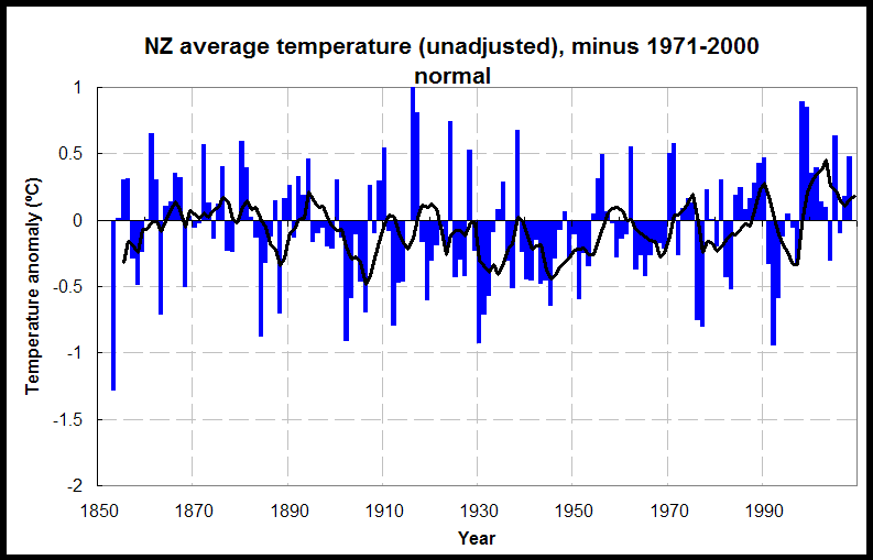
The irony of this proposal is that the US-managed global surface temperature record is contaminated by the UHI effects from urban weather stations all over the world, since so many of them are in towns and cities. Anthony Watts, at Watts Up With That, has gathered evidence of this and for years has been lobbying to have adjustments made to the dataset to remove the spurious UHI warming and see whether we really do have global warming.

There is strong evidence that if this was done most of the surface “warming” recorded over the last part of the 20th century would simply disappear.

How ironic that Rudman picks up on a solution incapable of solving a problem that doesn’t exist, but whose effect could be to remove evidence of the problem.

Uh, so it will solve global warming! White paint, anyone?

By the way, it’s important to remember that this solution only makes sense in low latitudes (closer to the equator), where cooling your building is sensible. In higher latitudes (closer to the poles), where it’s already colder, you must heat the building and you really want darker colours to warm it a bit and save that heating money. So you can’t really paint all the buildings white, only those in the warmer places. And you don’t want to paint the colder roads white, since they ice up more readily.

What a pity. It was such a good idea.

Visits: 86

Just tell me the blasted temperature!

It’s a simple question: “What is the temperature of the earth?” But for those who live here it has no simple answer, nor ever will have—only approximations. For it not only depends on where you put the thermometer, but also, apparently, on who interprets it. For if you own the dataset, you can reduce older temperatures and increase recent ones, just as NASA has been doing, and give the impression of greater warming. Naughty, naughty. more…

Visits: 63

The hockey stick

Here’s a story you haven’t heard, and you should have. An analyst, working for the government, uses computers to crunch numbers and find the truth. Let’s call him “Mann.” The trouble with Mann is, he has an ideology. He knows what he wants his results to be. more…

Visits: 88