The atmosphere went BLAM!
An angel nudged me:
“Look at this,” he grinned.
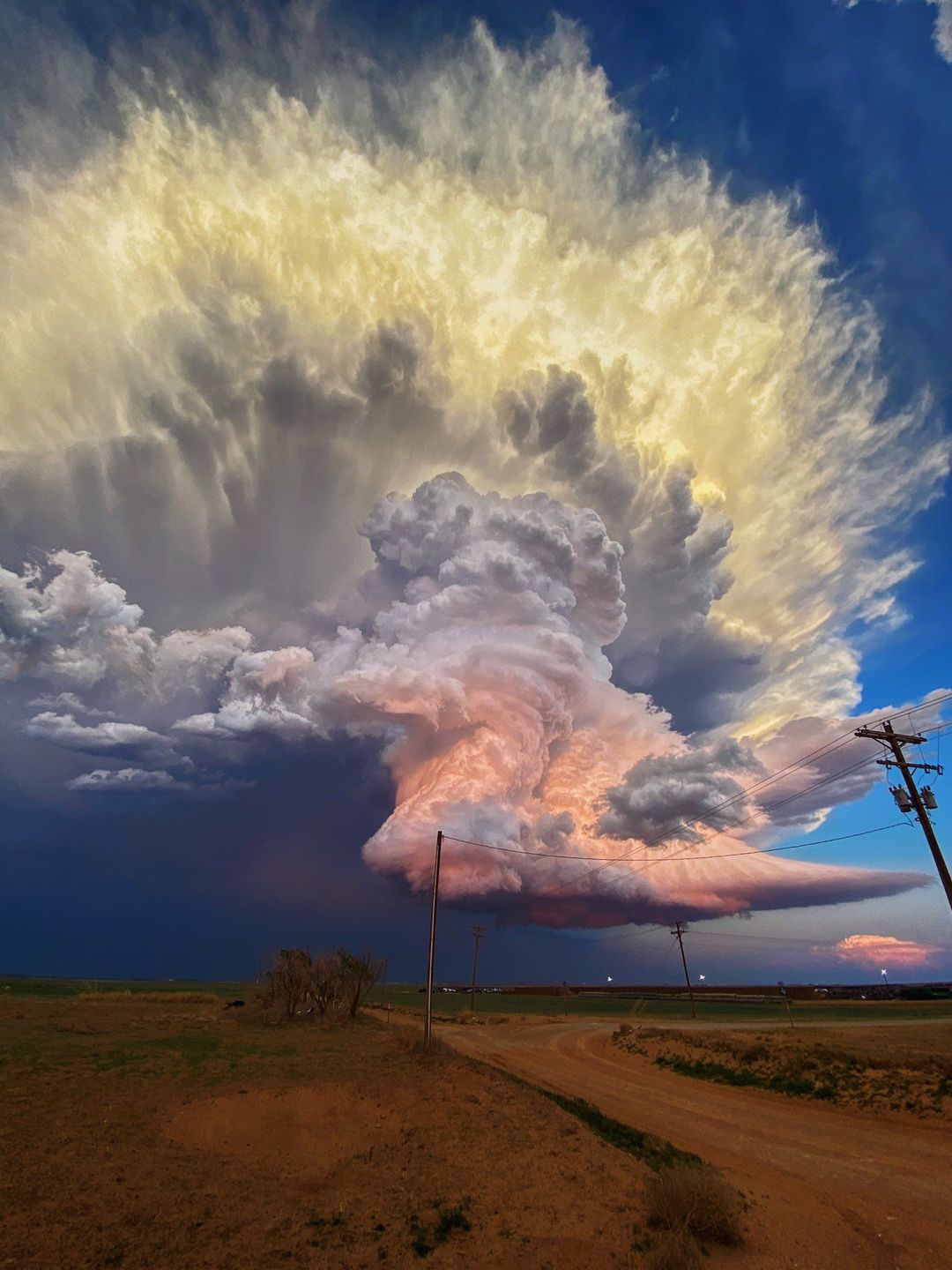
Supercell, Texas – May, 2022.
Totally wild
Click to enlarge
Views: 371

Supercell, Texas – May, 2022.
Click to enlarge
Views: 371
That’s beautiful and amazing, Richard. Who could witness that and not be awed by it?
Yes, isn’t it? I’ve never seen anything like it. Couldn’t resist posting it here.
I don’t think many people actually doubt the assertion that the Earth’s temperature is rising. It is one of those immutable facts from the information presented to us. Whilst we may have questions about the cause, there are few, if any, challenges to the fact that the Earth is warming. All the current doom of mankind comes from this assertion. So I asked a number of people why they were convinced that the Earth is actually warming in the first place. The answer was always the same. Everybody knows this and we have accurate satellite temperature measurements that clearly show warming. This is not open to question or to debate as the modern satellite record is indisputable.
On the back of this absolute faith in the accuracy of satellite temperatures I went to the NASA website.
“https://climate.nasa.gov/faq/49/which-measurement-is-more-accurate-taking-earths-surface-temperature-from-the-ground-or-from-space/
Ground thermometers are considered more accurate than satellite measurements when it comes to tracking temperature, and here’s why:
1. Satellites don’t directly measure temperature or the surface where people live. Instead, they measure the brightness of Earth’s atmosphere. Scientists then use computer models to convert this brightness data into temperature information.
2. To make matters more challenging, scientists gather brightness data from more than 16 different satellites. Think of it like receiving a box of puzzle pieces without a picture to guide you on how to complete the puzzle. Experts face a similar puzzle-solving task as they work with data from satellites that were launched in different decades since 1978. They must figure out how all these pieces fit together to create a coherent picture of Earth’s temperature.
3. Satellites measure the brightness of Earth’s atmosphere at various altitudes. For instance, they capture data from the layer of air closest to where people live, roughly the height where birds and airplanes fly. Scientists then combine and analyze these measurements, extending to about 23,000 feet (approximately 7,000 meters) in the atmosphere.
In summary, while satellites provide valuable information about Earth’s temperature, ground thermometers are considered more reliable because they directly measure the temperature where people reside. Satellite data require complex processing and modeling to convert brightness measurements into temperature readings, making ground thermometers a more direct and accurate source of temperature information for us.”
As it turns out, satellite temperatures, according to NASA, are not all they are cracked up to be. In fact, because the temperatures are not actual readings, but produced by computer models, then, in reality, these can easily be manipulated to show what ever results are required to support the narrative. After all, the majority of satellites for this purpose are operated by organizations that are funded by various governments and public bodies. The news outlets and main stream media this year gave us “Europe is on fire”. Turns out that the maps, covered in red, showing record temperatures, did not show actual temperatures at all. The Climate Reanalyzer department at the University of Maine had published a temperature map produced by, you guessed it, a computer model, but the main stream idiots ran with it anyway. A couple of days later, even NOAA, the US Government climate alarmists in chief, distanced themselves from this map, but the journalistic jerk-offs had already run with story, so were not in a mood to say “Oops, sorry, we got it wrong.” A very telling indictment of computer models, the same models that interpret the satellite data. One of the few independent organizations to assess satellite data is Remote Sensing Systems. They produce global temperature information from these satellite readings and are often cited as verification of the veracity of the satellite temperature record because of this independence. In 2016, RSS showed there had been no warming for decades and openly stated that the models used to calculate satellite temperatures were wrong. Having poked theirs heads above the parapets, they then came under a great deal of political pressure to get back in line with the demands of the climate alarmists. So, not for scientific reasons, but for political demands, the error range in the data was removed. The subsequent temperature graph then only showed the bottom of the error range from the late 1970’s to the early 1980’s and then showed the top of the error range into the 2010s. This skewed the graph to show a cooler past and a warming present, bringing RSS in to line with the demands of the climate mafia.
Can we trust temperature data produced, not by actual readings, but by computer models? We have enough experience of computer models to know garbage in, garbage out.
Can we trust the computer models that are produced by the same climate alarmists that push man made climate change in the first place and rely on this narrative for their funding? After all, we have a 40 year plus history of failed climate predictions, based on computer models.
Have NASA, or any other organization, adequately investigated other possible reasons for changes in atmospheric “brightness”? Dumb question. Of course not. That could possibly throw a spanner in the works and we can’t have that now can we.
As NASA themselves state, ground based measurements provide a more accurate alternative. So, we can’t actually trust the satellite data, but can we trust the ground based data?
TD, a thorough analysis, if I may say, and very helpful. Then you say:
You might like to include a reference when citing someone—helps the credibility of people quoting you. Mind you, I often forget!
Cheers,
Richard.
So, can we trust ground based temperature measurements? Are they less prone to tampering and manipulation? The short answer is NO. If anything, the ground based temperature record is much more of a tool for the climate mafia purely because it doesn’t need to be massaged as much to give the correct warming results. Most often cited is NOAA, but we know these guys are run by the US Government and definitely toe the line when it comes to temperatures. According to NOAA, their ground based weather stations across the USA have shown definite warming, without the need for much in the way of data tampering. Just reporting the “almost” facts. We have seen many independent studies that have clearly shown this warming is due to urban heat island effect. No need to mess so much with the data when concrete and tarmac will do the job for you. As we have seen on numerous occasions, many of these ground based weather stations are sited right next to heat sources such as car parks and air conditioning systems. According to the NOAA data, most warming of the US ground based temperatures takes place at night, strongly indicating urban heat island effect. We also have the NOAA practice of filling in data from areas where there are no ground stations with, you guessed it, computer models.
Hottest ever temperature in Europe – 48.8 c recorded in Sicily in 2021. Hottest Day in French History: 45.9°C by Dr Jeff Masters, 2019.
But just a little digging and you would find:
“National Advocate, Bathurst NSW. August 30 1930.
From Australian Government website
https://trove.nla.gov.au/newspaper/article/159866905#
FRENCH HEAT WAVE
Worst for 60 Years
FRANCE. Thursday
France is also suffering extraordinary heat. The Shade temperature in Paris today was 100 degrees, which is the hottest experienced late in August since 1870. There were numerous cases of collapse reported from the Loire region, where it was 122 degrees. The
Paris police were granted special permission to return to the stations hourly for refreshing drinks.”
Now I know maths is a construct of white colonialism, but 122 degrees F is 50 degrees C, so I would like to know when did 45.9 and 48.8 become more than 50? Britain had its highest ever temperature in July 2022. It was recorded at RAF Coningsby in Lincolnshire. The weather station that measured this showed 40.3 c for a few seconds. It is situated next to a main runway and the record came just after a flight of 3 RAF Typhoons had landed on that runway in quick secession. Funny that.
We know that mercury thermometers have been in use since the middle of the 19th century and it is generally agreed that, by the end of the 19th century, they were actually very accurate and stable. When it comes to temperature information collected at the turn of the 19th and 20th centuries, we can be pretty confident in the data, particularly as these mercury thermometers gave reproducible and consistent readings. In fact, these have been shown to be more accurate and reliable compared to many of the mass produced digital thermometers commercially available today. NOAA tell us that the average surface temperature for 2022 was 14.76°C and the average from 1880 to 1900 was 13.7°C. NASA, HadCRUT and Berkeley also give temperatures of between 13.5°C and 13.7°C at the start of the 20th century. It begs the question, where did these organizations get their year 1900 temperatures from. We know the main contributors to global temperature records around that time. We can look at the work of Dove, Forbes, Ferrel, Spitaler, Batchelder, Arrhenius, von Bezold, Hopfner, von Hann, and Bornstein, as cited by Kramm et al in their 2019 paper “Meridional Distributions of Historical Zonal Averages and Their Use to Quantify the Global and Spheroidal Mean Near-Surface Temperature of the Terrestrial Atmosphere.” They cite the 1908 paper by von Hann as the most accurate, giving a global mean temperature of 14.4°C. If this is correct, and the Kramm research shows that it is, then we have had 0.36°C warming from 1908 to 2022. That is, if you believe NOAA and their notoriously bad data. If we look at Temperature.Global these guys take a running 12 month average of ground based weather stations. Here is the entry as of 9.30 am on Monday November 13th New Zealand time.
Currently: 57.33°F/14.07°C. Deviation: 0.13°F/0.07°C.
Stations processed last hour: 58978.
Last station processed: Karup, Denmark
The historical temperature record from this data is:
2015 average – 13.46°C
2016 average – 13.73°C
2017 average – 13.74°C
2018 average – 13.26°C
2019 average – 13.64°C
2020 average – 14.00°C
2021 average – 13.89°C
2022 average – 13.74°C
The blazing hot months of August and September were actually 14.22°C and 14.18°C, well below the NOAA average of 14.76°C for 2022.
So, satellite temperatures, according to NASA, are not the accurate and indisputable record that we are lead to believe. If Kramm and von Hann are correct, then at worst case we have 0.36°C warming according to NOAA. If von Hann and Temperature.Global are correct, we have actually cooled over the last 100 years. If NOAA, NASA, HadCRUT and Berkeley are correct about the 1900 temperature and Temperature.Global are correct about the current temperatures, then we haven’t had any statistical warming for over a century.
Temperature.Global use data from NOAA Global METARs, NOAA One-Minute Observations (OMOs), NBDC Global Buoy Reports and MADIS Mesonet Data. They use unadjusted surface temperatures. I know who I am likely to believe given the establishments shameful record of data tampering.
Well said, TD! And the establishment’s alarmist ‘climate science’ just keeps on going from bad to worse. Now the Daily Sceptic’s Chris Morrison reports (here):
Junk Science Alert: Met Office Set to Ditch Actual Temperature Data in Favour of Model Predictions
“The alternative climate reality that the U.K. Met Office seeks to occupy has moved a step nearer with news that a group of its top scientists has proposed adopting a radical new method of calculating climate change. The scientific method of calculating temperature trends over at least 30 years should be ditched, and replaced with 10 years of actual data merged with model projections for the next decade. The Met Office undoubtedly hopes that it can point to the passing of the 1.5°C ‘guard-rail’ in short order. This is junk science-on-stilts, and is undoubtedly driven by the desire to push the Net Zero collectivist agenda…”
How can someone with the eminent scientific qualifications of Prof. Betts, the lead author of this intellectually toxic paper, not know – with certainty – that what he and his retinue of satellites at the Met Office are proposing is a depraved kind of pseudoscience that will lead ultimately only to the complete confusion and bewilderment of all who accept it as genuine and base life-affecting decisions upon it? This is the globalist establishment’s psychopathy on public display.
The climate mafia were coming after cows because of their methane production. Now they are coming after you!!!!! A new peer-reviewed study says human breathing ‘Contributes to Global Warming’ – Finds ‘Human respiration has a net warming effect on the atmosphere’ – Published in PLOS ONE. Apparently we breath out methane and NO2 and add to global warming. Women are more guilty than men in this respect as a greater percentage produce methane. Stop breathing everyone. It’s the only way we can save the planet. The climate terrorists are coming for you, make no mistake. Another very convenient tax in the making. Mind you, after a night out on the beers and a curry, I could probably add another 5 degrees of warming single handed 😉
Hi John,
Good link to all that is wrong with modern climate pseudo science. The problem, as I see it, was inelegantly stated by James Hansen, NASA’s original climate terrorist in chief. In an interview, Hansen was asked if he would have changed his predictions, given that they had all failed. The answer was that his predictions were not wrong and the science was clear, sound and settled. The problem was that Earth and nature were refusing to behave as predicted. In other words, Hansen wasn’t wrong, planet Earth was wrong. So, if you are a climate alarmist, or someone who depends on the narrative to earn a very lucrative salary, what do you do when nature won’t do as she is told? You make sh*t up. 2023 has been an absolute gift for the climate alarmists. I noticed here in New Zealand that any moron with a public platform was quick to conflate cyclone Gabrielle, an extreme local weather event, with global climate. Let us be clear, all you B grade celebs out there, all you imbecilic news reporters and certain cretinous cartoonists, LOCAL WEATHER EVENTS, NO MATTER HOW BAD, ARE NOT GLOBAL CLIMATE!!!!! No doubt there will be more to come once we have the full wash out from the Chicanery Of The Perfidious (COP) 28 meeting in the UAE but I won’t be holding my breath for anything sensible or practical other than more ways to screw money from us. And for those who don’t want to look it up: Chicanery – the use of deception or subterfuge to achieve one’s purpose. Perfidious – deceitful and untrustworthy.
The Evil Vehicle or EV. How are these things still being sold, never mind being pushed and promoted as saviours of the planet. Granted, EV fires are less frequent in comparison to Infernal (sic) Combustion Engine (ICE) fires, but the problems caused by EV fires are far more serious. Most ICE fires can be prevented by regular and thorough maintenance, but EVs seem to have a mind of their own. I recently watched a video of a couple of EV fires. Granted that the 2 vehicles involved are an unusually poor design. The battery pack in each case makes the rear floor pan of the passenger compartment. The Jeep Wrangler hybrid and the Renault Zoe. Once a thermal runaway starts, the battery does not immediately burst in to flame, but produces a cocktail of toxic gases and hydrogen. In the case of these 2 vehicles, because of the battery location, these vent in to the passenger compartment. This process goes on for about 4 minutes before the battery ignites. In the incidents I saw, the vehicles were fortunately unoccupied when this happened, because the resultant explosion blew the entire roof off the Jeep and was enough to burst all the door locks on the Renault. Had the vehicles been in use, the occupants would probably have died from the toxic atmosphere but would certainly have died when the hydrogen ignited and the passenger compartment exploded. Then we have the environmental destruction caused by the lithium mining. To quote mining-technology.com:
“Sulfuric acid and sodium hydroxide used in lithium extraction penetrate the soil and water, poisoning ecosystems and endangering species. Research from the journal Proceedings of the Royal Society shows that two flamingo species in Chile are threatened because of lithium mining. Deforestation, habitat destruction and water pollution further exacerbate the ecological toll. The delicate balance of nature is disrupted, which leaves long-lasting damage that takes generations to heal. The carbon dioxide and other greenhouse emissions that come with the process of lithium mining, extraction and overall production are worse for the climate than the production of fossil fuel-powered vehicles. A study from The Wall Street Journal in 2019 revealed that 40% of the total climate impact caused by the production of lithium-ion batteries comes from the mining process itself.”
So, pollution of water sources, poisoning of fish, soil contamination, destruction of environments, air pollution and the “carbon footprint” of just getting a bloody Tesla in to the showroom are far higher than my 1600 cc ice car and will stay that way until I get to around 100,000 kms. According to an article published in the UK daily mail the CO2 used to produce a Volvo XC40 is 14 tonnes. The CO2 used to produce a Polestar 2 EV is 24 tonnes. EV tires and brakes produce 2000 time more particulate pollution compared to an ice vehicle. Most of the cobalt used in EV manufacture come from the Congo, where there are an estimated 2000 deaths a year as a direct result of the mining. In one province alone there are an estimated 40,000 children working in the mines. Cobalt is also extremely toxic and many of the men, women and children working in these mines are using primitive tools and their hands to dig. Even if these inhumane practices stopped today, the death toll would continue to rise for years to come.
And what is the end goal? Stop all new ice car production and sales by 2030. Only EV sales to be allowed. Lithium would be in short supply pushing the price of EVs out of the reach of the common man. Good second hand ice vehicles would be in short supply and the cost of petrol would be sky high due to falling demand and extortionate carbon taxes, meaning your average citizen can only use public transport. This has to be paid for by credit card or travel card as cash is not accepted. Goal achieved. Joe Blogs no longer has the freedom of movement to go where he wants, when he wants, a freedom that was afforded by the vile ice vehicle and a freedom that the ruling classes always wanted to stop. Now, they always know where you are and where you are going. Proof, if any more were needed, that the current movement to EVs is nothing at all to do with the environment or climate change, but everything to do with control of our lives. So the next time you meet some smug tosser in his Tesla, ask him how he can live with the exploitation of child labour and supporting what is modern slavery. Ask him how he can justify the environmental destruction caused by lithium mining and when he says Tesla would never condone such practices, remind him that Tesla buy their batteries from the Chinese manufacturer BYD and they don’t give a toss about dying kids in the Congo. Ask him about the environmental impact of all the used batteries that no one knows what to do with. I have reports from the UK that old batteries are being loaded in to containers and dumped at sea. Very environmentally friendly. Then remind him that the annual insurance premium for an EV in the UK is around $10,000, and you can bet these kinds of premiums will be making their way to NZ in the near future. Even a small ding in an EV means the vehicle is written off because there can be damage to the batteries that can result in a fire.
EVs MUST BE STOPPED. They are killing the environment, killing kids, killing wildlife and killing the planet.
With acknowledgement to a protesting German farmer:
Without blood you are white
Without air to breathe you are blue
Without a brain you are green
Just the latest little snippet of information. Department of Water Resources and Environmental Engineering, School of Civil Engineering, National Technical University of Athens, published by MDPI, the worlds largest publisher of scientific literature: https://www.mdpi.com/2413-4155/6/1/17
“Recent studies have provided evidence, based on analyses of instrumental measurements
of the last seven decades, for a unidirectional, potentially causal link between temperature as the
cause and carbon dioxide concentration ([CO2]) as the effect. In the most recent study, this finding
was supported by analysing the carbon cycle and showing that the natural [CO2] changes due
to temperature rise are far larger (by a factor > 3) than human emissions, while the latter are no
larger than 4% of the total.”
“These findings confirm the major role of the biosphere in the carbon cycle and a non-discernible
signature of humans.”
I would be pretty certain that this will not make the next UNIPCC climate report.
Hi Richard,
Yup, sorry. The insert about RSS came from Tony Heller. https://realclimate.science/2023/09/23/rapidly-changing-climate/#gsc.tab=0. I have downloaded the whole satellite data set from Dr Roy Spencer going back to the end of 1978. It clearly shows a number of interesting trends. There is an overall increase in temperature since 1978. I don’t think anyone can argue this. However, the trend from 1978 to 1986 is down. It is only a drop of 0.15 c, but it is definitely a downward trend in spite of increasing CO2. The trend for 1987 to 1997 is flat – 10 years. However, in support of the original RSS assertion, the UAH data clearly shows no warming between 1997 and 2015. The trend line is as flat as Joe Biden’s EEG. That is 18 years with no increasing temperature trend. The IPCC contend that there is a linear increase in energy input to the climate system due to carbon dioxide. So why don’t temperature trends consistently correlate to this CO2 trend? I would be interested in a credible explanation.
Simply: carbon dioxide is a less than trivial influence on atmospheric temperature. Have a look at this short paper published four days ago by Linzen, Happer and van Wijngaarden, Net Zero Averted Temperature Increase. I ought to write a post about it but I’m a bit busy. We were alerted by Jo Nova’s post on it.