
Gavin Schmidt and Reference Period “Trickery”
— by Steve McIntyre, Climate Audit – Apr 19, 2016

This is an adopted article.
In the past few weeks, I’ve been re-examining the long-standing dispute over the discrepancy between models and observations in the tropical troposphere. My interest was prompted in part by Gavin Schmidt’s recent attack on a graphic used by John Christy in numerous presentations (see recent discussion here by Judy Curry). Schmidt made the sort of offensive allegations that he makes far too often:
@curryja use of Christy’s misleading graph instead is the sign of partisan not a scientist. YMMV. tweet.
@curryja Hey, if you think it’s fine to hide uncertainties, error bars & exaggerate differences to make political points, go right ahead. tweet.
As a result, Curry decided not to use Christy’s graphic in her recent presentation to a congressional committee. In today’s post, I’ll examine the validity … of Schmidt’s critique.
Schmidt’s primary dispute, as best I can understand it, was about Christy’s centring of model and observation data to achieve a common origin in 1979, the start of the satellite period, a technique which (obviously) shows a greater discrepancy at the end of the period than if the data had been centred in the middle of the period. I’ll show support for Christy’s method from his long-time adversary, Carl Mears, whose own comparison of models and observations used a short early centering period (1979-83) “so the changes over time can be more easily seen”. Whereas both Christy and Mears provided rational arguments for their baseline decision, Schmidt’s argument was little more than shouting.
Background
The full history of the controversy over the discrepancy between models and observations in the tropical troposphere is voluminous. While the main protagonists have been Christy, Douglass and Spencer on one side and Santer, Schmidt, Thorne and others on the other side, Ross McKitrick and I have also commented on this topic in the past, and McKitrick et al. (2010) was discussed at some length by IPCC AR5, unfortunately, as too often, deceptively on key points.
Starting Points and Reference Periods
Christy and Spencer have produced graphics in a similar style for several years. Roy Spencer (here) in early 2014 showed a similar graphic using 1979-83 centering (shown below). Indeed, it was this earlier version that prompted vicious commentary by Bart Verheggen, commentary that appears to have originated some of the prevalent alarmist memes.

Figure 1. 2014 version of the Christy graphic, from Roy Spencer blog. This used 1979-83 centering. This was later criticized by Bart Verheggen.
Christy’s February 2016 presentation explained this common origin as the most appropriate reference period, using the start of a race as a metaphor:
To this, on the contrary, I say that we have displayed the data in its most meaningful way. The issue here is the rate of warming of the bulk atmosphere, i.e., the trend. This metric tells us how rapidly heat is accumulating in the atmosphere – the fundamental metric of global warming. To depict this visually, I have adjusted all of the datasets so that they have a common origin. Think of this analogy: I have run over 500 races in the past 25 years, and in each one all of the runners start at the same place at the same time for the simple purpose of determining who is fastest and by how much at the finish line. Obviously, the overall relative speed of the runners is most clearly determined by their placement as they cross the finish line – but they must all start together.
The technique used in the 2016 graphic varied somewhat from the earlier style: it took the 1979 value of the 1975-2005 trend as a reference for centering, a value that was very close to the 1979-83 mean.
Carl Mears
Ironically, in RSS’s webpage comparison of models and observations, Christy’s longstanding adversary, Carl Mears, used an almost identical reference period (1979-84) in order that “the changes over time can be more easily seen”. Mears wrote that “If the models, as a whole, were doing an acceptable job of simulating the past, then the observations would mostly lie within the yellow band”, but that “this was not the case”:
The yellow band shows the 5% to 95% envelope for the results of 33 CMIP-5 model simulations (19 different models, many with multiple realizations) that are intended to simulate Earth’s Climate over the 20th Century. For the time period before 2005, the models were forced with historical values of greenhouse gases, volcanic aerosols, and solar output. After 2005, estimated projections of these forcings were used. If the models, as a whole, were doing an acceptable job of simulating the past, then the observations would mostly lie within the yellow band. For the first two plots (Fig. 1 and Fig. 2), showing global averages and tropical averages, this is not the case.
Mears illustrated the comparison in the following graphic, the caption to which states the reference period of 1979-84 and the associated explanation.

Figure 2. From RSS. Original caption: Tropical (30S to 30N) Mean TLT Anomaly plotted as a function of time. The the blue band is the 5% to 95% envelope for the RSS V3.3 MSU/AMSU Temperature uncertainty ensemble. The yellow band is the 5% to 95% range of output from CMIP-5 climate simulations. The mean value of each time series average from 1979-1984 is set to zero so the changes over time can be more easily seen. Again, after 1998, the observations are likely to be below the simulated values, indicating that the simulation as a whole are predicting more warming than has been observed by the satellites.
The very slight closing overlap between the envelope of models and envelope of observations is clear evidence – to anyone with a practised eye – that there is a statistically significant difference between the ensemble mean and observations using the t-statistic, as in Santer et al. 2008 (more on this in another post).
Nonetheless, Mears did not agree that the fault lay with the models [and] instead argued, together with Santer, that the fault lay with errors in forcings, errors in observations and internal variability (see here). Despite these differences in diagnosis, Mears agreed with Christy on the appropriateness of using a common origin for this sort of comparison.
IPCC AR5
IPCC, which, to borrow Schmidt’s words, is not shy about “exaggerat[ing or minimizing] differences to make political points”, selected a reference period in the middle of the satellite interval (1986-2005) for their AR5 Chapter 11 Figure 11.25, which compared a global comparison of CMIP5 models to the average of four observational datasets.

Figure 3. IPCC AR5 WG1 Figure 11.25a.
The effective origin in this graphic was therefore 1995, reducing the divergence between models and observations to approximately half of the full divergence over the satellite period. Roy Spencer recently provided the following diagram, illustrating the effect of centering two series with different trends at the middle of the period (top panel below), versus the start of the period (lower panel). If the two trending series are centered in the middle of the period, then the gap at closing is reduced to half of the gap arising from starting both series at a common origin (as in the Christy diagram.)


Figure 4. Roy Spencer’s diagram showing difference between centering at the beginning and in the middle.
Bart Verheggen
The alarmist meme about supposedly inappropriate baselines in Christy’s figure appears to have originated (or at least appeared in an early version) in a 2014 blogpost by Bart Verheggen, which reviled an earlier version of the graphic from Roy Spencer’s blog shown above, which had used 1979-83 centering, a choice that was almost exactly identical to the 1979-84 centering that [was] later used by RSS/Carl Mears (1979-84).
Verheggen labelled such baselining as “particularly flawed” and accused Christy and Spencer of “shifting” the model runs upwards to “increase the discrepancy”:
They shift the modelled temperature anomaly upwards to increase the discrepancy with observations by around 50%.
Verheggen claimed that the graphic began with an 1986-2005 reference period (the period used by IPCC AR5) and that Christy and Spencer had been “re-baseline[d]” to the shorter period of 1979-83 to “maximize the visual appearance of a discrepancy”:
The next step is re-baselining the figure to maximize the visual appearance of a discrepancy: Let’s baseline everything to the 1979-1983 average (way too short … a period and chosen very tactically it seems)… Which looks surprisingly similar to Spencer’s trickery-graph.
Verheggen did not provide a shred of evidence showing that Christy and Spencer had first done the graphic with IPCC’s middle-interval reference period and then “re-baselin[ed]” the graphic to “trick” people. Nor, given that the reference period of “1979-83” was clearly labelled on the y-axis, it hardly required reverse engineering to conclude that Christy and Spencer had used a 1979-83 reference period nor should it have been “surprising” that an emulation using a 1979-83 reference period would look similar. Nor has Verheggen made similar condemnations of Mears’ use of a 1979-84 reference period to enable the changes to be “more easily seen”.
Verheggen’s charges continue to resonate in the alarmist blog community. A few days after Gavin Schmidt challenged Judy Curry, Verheggen’s post was cited at Climate Crocks as the “best analysis so far of John Christy’s go-to magical graph that gets so much traction in the deniosphere”.
The trickery is entirely the other way. Graphical techniques that result in an origin in the middle of the period (~1995) rather than the start (1979) reduce the closing discrepancy by about 50%, thereby hiding the divergence, so to speak.
Gavin Schmidt
While Schmidt complained that the Christy diagram did not have a “reasonable baseline”, Schmidt did not set out criteria for why one baseline was “reasonable” and another wasn’t, or what was wrong with using a common origin (or reference period at the start of the satellite period) “so the changes over time can be more easily seen” as Mears had done.
In March 2016, Schmidt produced his own graphics, using two different baselines to compare models and observations. Schmidt made other iconographic variations to the graphic (which I intend to analyse separately), but for the analysis today, it is the reference periods that are of interest.
Schmidt’s first graphic (shown in the left panel below – unfortunately truncated on the left and right margins in the Twitter version) was introduced with the following comment:
Hopefully final versions for tropical mid-troposphere model-obs comparison time-series and trends (until 2016!).
This version used 1979-1988 centering, a choice which yields relatively small differences from Christy’s centering. Victor Venema immediately ragged Schmidt about producing anomalies so similar to Christy and wondered about the reference period:
@ClimateOfGavin Are these Christy-anomalies with base period 1983? Or is it a coincidence that the observations fit so well in beginning?
Schmidt quickly re-did the graphic using 1979-1998 centering, thereby lessening the similarity to “Christy anomalies”, announcing the revision (shown on the right below) as follows:
@VariabilityBlog It’s easy enough to change. Here’s the same thing using 1979-1998. Perhaps that’s better…
After Schmidt’s “re-baselining” of the graphic (to borrow Verheggen’s term), the observations were now shown as within the confidence interval throughout the period. It was this second version that Schmidt later proffered to Curry as the result arising from a “more reasonable” baseline.


Figure 5. Two figures from Gavin Schmidt tweets on March 4, 2016. Top – from March 4 tweet, using 1979-1988 centering. Note that parts of the graphic on the left and right margins appear to have been cut off, so that the graph does not go to 2015. Bottom – second version using 1979-1998 centering, thereby lowering model frame relative to observations.
The incident is more than a little ironic in the context of Verheggen’s earlier accusations. Verheggen showed a sequence of graphs going from a 1986-2005 baseline to a 1979-1983 baseline and accused Spencer and Christy of “re-baselining” the graphic “to maximize the visual appearance of a discrepancy” – which Verheggen called “trickery”. Verheggen made these accusations without a shred of evidence that Christy and Spencer had started from a 1986-2005 reference period – a highly questionable interval in the first place, if one is trying to show differences over the 1979-2012 period, as Mears had recognized. On the other hand, prompted by Venema, Schmidt actually did “re-baseline” his graphic, reducing the “visual appearance of a discrepancy”.
The Christy Graphic Again
Judy Curry had reservations about whether Schmidt’s “re-baselining” was sufficient to account for the changes from the Christy figure, observing:
My reaction was that these plots look nothing like Christy’s plot, and its not just a baseline issue.
In addition to changing the reference period, Schmidt’s graphic made several other changes:
- Schmidt used annual data, rather than a 5-year average.
- Schmidt showed a grey envelope representing the 5-95% confidence interval, rather than showing the individual spaghetti strands.
- Instead of showing 102 runs individually, Christy showed averages for 32 models. Schmidt seems to have used the 102 runs individually, based on his incorrect reference to 102 models(!) in his caption.
I am in the process of trying to replicate Schmidt’s graphic. To isolate the effect of Schmidt’s re-baselining on the Christy graphic, I replicated the Christy graphic as closely as I could, with the resulting graphic (second panel) capturing the essentials in my opinion, and then reproduced the graphic using Schmidt centering.
The third panel isolates the effect of Schmidt’s 1979-1998 centering period. This moves downward both models and observations, models slightly more than observations. However, in my opinion, the visual effect is not materially changed from Christy centering. This seems to confirm Judy Curry’s surmise that the changes in Schmidt’s graphic arise from more than the change in baseline. One possibility was that change in visual appearance arose from Christy’s use of ensemble averages for each model, rather than individual runs. To test this, the fourth panel shows the Christy graphic using runs. Once again, it does not appear to me that this iconographic decision is material to the visual impression. While the spaghetti graph on this scale is not particularly clear, the INM-CM4 model run can be distinguished as the singleton “cold” model in all four panels.

Figure 1. Christy graphic (left panel) and variations. See discussion in text. The blue line shows the average of the UAH 6.0 and RSS 3.3 TLT tropical data.
Conclusion

There is nothing mysterious about using the gap between models and observations at the end of the period as a measure of differing trends. When Secretariat defeated the field in the 1973 Belmont by 25 lengths, even contemporary climate scientists did not dispute that Secretariat ran faster than the other horses.
Even Ben Santer has not tried to challenge whether there was a “statistically significant difference” between Steph Curry’s epic 3-point shooting in 2015-6 and leaders in other seasons. Last weekend, NYT Sports illustrated the gap between Steph Curry and previous 3-point leaders using a spaghetti graph (see below) that, like the Christy graph, started the comparisons with a common origin. The visual force comes in large measure from the separation at the end.
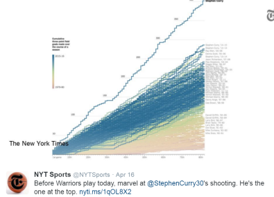
If NYT Sports had centered the series in the middle of the season (in Bart Verheggen style), then Curry’s separation at the end of the season would be cut in half. If NYT Sports had centered the series on the first half (in the style of Gavin Schmidt’s “reasonable baseline”), Curry’s separation at the end of the season would likewise be reduced. Obviously, such attempts to diminish the separation would be rejected as laughable.
There is a real discrepancy between models and observations in the tropical troposphere. If the point at issue is the difference in trend during the satellite period (1979 on), then, as Carl Mears observed, it is entirely reasonable to use center the data on an early reference period such as the 1979-84 used by Mears or the 1979-83 period used by Christy and Spencer (or the closely related value of the trend in 1979) so that (in Mears’ words) “the changes over time can be more easily seen”.
Varying Schmidt’s words, doing anything else will result in “hiding” and minimizing “differences to make political points”, which, once again in Schmidt’s words, “is the sign of partisan not a scientist.”
There are other issues pertaining to the comparison of models and observations which I intend to comment on and/or re-visit.
Views: 124
A fascinating account of bluster, obfuscation, and manipulation by the ideologues. What would we do without the sane and careful observations of the pea under the thimbles by McIntyre & McKitrick?
Thank you very much for taking the time and effort to highlight this issue RT, even if it is Steve M’s original work. It’s something of a major “battle line” in the climate wars I think. Good to see Willem de Lange is onto it too.
Following Mike, amazing to see the duplicity and chicanery from Schmidt and ilk (IPCC too).
I think it is VERY important for people to know EXACTLY what they are looking at when confronted with a models vs obs graph. As time goes on, and the discrepancy becomes ever more apparent, I think we can expect the trickery from the defense to increase. There’s already some very dodgy graphs being peddled (e.g. from recent Mann et al paper as Tweeted by Rahmstorf, Mann et al “adjusted” the models profile – entirely bogus).
The models-obs discrepancy comes as a shock to many ignorant warmies. I posted a Christy graph at Gareth Morgan’s website only to be met with “where did you get that crazy graph?” from one of his sycophants. Too funny that Carl Mears agrees with John Christy, I bet this rankles with Thomas at Hot Topic. It was Thomas who persuaded Mears to change the RSS graph in the McIntyre post above to include the certainty range (blue) rather than the central line (was a black line). See this thread for that story:
http://hot-topic.co.nz/too-hot-and-here-comes-the-surge-2/#comment-47175
>”Schmidt used annual data, rather than a 5-year average.”
Big issue. The models do NOT mimic ENSO activity i.e the only apples-to-apples comparison is models to data with ENSO fluctuation removed by say, a 5-year average as per Christy, Schmidt is currently claiming the El Nino spike for AGW (that might change of course once a La Nina sets in but I doubt we’ll see the headlines).
>”let me know if you……see something I missed”
Nothing material but there is this Josh cartoon featuring Gavin Schmidt:
My Horse Won!
https://wattsupwiththat.files.wordpress.com/2016/04/gavin-horse.jpg
Mike,
What would we do, indeed! They are true climate warriors.
RC,
You’re welcome. It was probably the thick end of four hours to download, format and edit. Painstaking stuff. But it’s rich and revealing — worth every minute. Posting this lets us see what you have to say about it, too — thank you.
>”The third panel isolates the effect of Schmidt’s 1979-1998 centering period. This moves downward both models and observations, models slightly more than observations. However, in my opinion, the visual effect is not materially changed from Christy centering. This seems to confirm Judy Curry’s surmise that the changes in Schmidt’s graphic arise from more than the change in baseline.”
In other words, there’s more to come out of this – watch the space.
Notice that the model envelope differs between Mears’, Schmidt’s, and Christy’s renderings i.e. imagine a smoothed upper and lower bound in each respective case. A good place to start is the upper model bound either side of 2010 for comparison between the three.
Then look at Figure 5. Two figures from Gavin Schmidt tweets on March 4, 2016. The upper and lower model bounds are different in each of Schmidt’s figures irrespective of series length.
>”Two figures from Gavin Schmidt tweets on March 4, 2016″
Simon posted one of those figures here at CCG. I don’t know which one it was and I bet he’s not sure which either.
I might dig out Simon’s comment when I get time.
>”Simon posted one of those figures here at CCG”
Turns out it wasn’t one of the Schmidt figures. Simon posted this graph:
This baseline issue has a different twist in SLR issues (see post ‘Sea rising dangerously — yeah, nah’).
Both Commisioner for the Environment Dr Jan Wright (MfE) and Associate Professor Nancy Bertler (GNS) neglect the IPCC’s SLR prediction baseline. See chart provided in post referenced above reproduced here:
“30cm in 30 years incredibly certain”
https://www.climateconversation.org.nz/wp/wp-content/uploads/2016/04/sea-level-prediction-cfte-2016.png
Actually incredibly stupid, and dead wrong in terms of baseline which should be 1990.
‘Schmidt’s Histogram Diagram Doesn’t Refute Christy’
Steve McIntyre, posted on May 5, 2016
In my most recent post, I discussed yet another incident in the long running dispute about the inconsistency between models and observations in the tropical troposphere – Gavin Schmidt’s twitter mugging of John Christy and Judy Curry. Included in Schmidt’s twittering was a diagram with a histogram of model runs. In today’s post, I’ll parse Schmidt’s diagram, first discussing the effect of some sleight-of-hand and then showing that Schmidt’s diagram, after removing the sleight-of-hand and when read by someone familiar with statistical distributions, confirms Christy rather than contradicting him
Continues>>>>>>
https://climateaudit.org/2016/05/05/schmidts-histogram-diagram-doesnt-refute-christy/
Steve M:
They grey envelope is one of climate science’s more egregious depictions. I look forward to Steve McIntyre dissecting it.
Schmidt Blasts Christy For “Misleading” Congress
http://www.reportingclimatescience.com/2016/05/08/schmidt/
Old news re Schmidt’s April 4 Twitter remark. Reporting Climate Science are in catch-up mode after redesigning their blog. Some water under the bridge since then.
‘Schmidt Blasts Christy For “Misleading” Congress’
Posted By: Site Admin May 8, 2016
Climate scientist Gavin Schmidt, director of NASA’s Goddard Institute for Space Studies (GISS), has used a blog post to launch a blistering attack on fellow climate scientist John Christy from the University of Alabama in Huntsville (UAH).
Schmidt’s posting on the realclimate.org blog yesterday (7 May 2016) describes Christy’s use of graphs presented to the US Congress earlier this year as “misleading”.
[See Christy graphs]
The graphs were presented by Christy to US House Committee on Science, Space and Technology on 16 February 2016. They compare climate model predictions for global warming with satellite data on global temperatures.
Christy argued in his testimony that the graphs show that models, on average, predict a warming of the atmosphere that is about 2.5 times faster than that observed from satellites measurements – the implication being that climate models exaggerate the risks of future climate change. Schmidt states in his blog that Christy’s graphs are misleading because of the choice of baseline, the use inconsistent data smoothing and the treatment of data and model uncertainties.
Satellites
Christy’s use of this comparison between satellite measurements and model forecasts has attracted criticism over the use of satellite data for global temperature analysis. In his House testimony in February, Christy explained in some detail why satellite-derived temperatures are more reliable indicators of global warming than surface thermometers.
Schmidt, a forceful advocate of the case for human driven climate change and a supporter of surface temperature measurements, and Christy, an acknowledged sceptic and a pioneer of satellite temperature monitoring, have crossed swords before. The debate has been sharpened by changes last year to the way NASA analyses surface temperature data which had the effect of increasing the rate of global warming shown by surface temperature measurements – a faster rate than indicated by satellites.
The row over the use of these graphs erupted in public in April when Schmidt criticised another climate scientist, Judith Curry from the Georgia Institute Of Technology, for planning to use Christy’s graphs in a presentation questioning whether models are “too sensitive” to greenhouse warming. Schmidt tweeted then that “use of Christy’s misleading graph instead is the sign of partisan not a scientist”.
Schmidt criticises Curry on twitter in April for planing to use the same graphs. Courtesy: Twitter.
Sources
Gavin Schmidt’s blog on realclimate.org [hotlink]
http://www.reportingclimatescience.com/2016/05/08/schmidt/
Christy: Schmidt Is “Completely Wrong”
Posted By: Site Admin May 8, 2016
Climate scientist John Christy has responded to the blog attack yesterday (7 May 2016) from fellow climate scientist Gavin Schmidt.
Christy, from the University of Alabama in Huntsville, was accused by Schmidt, who is director of NASA’s Goddard Institute for Space Studies, of giving “misleading” testimony to the US Congress earlier this year.
Christy told reportingclimatescience.com in an email that it has been “thoroughly demonstrated that Schmidt (again) was completely wrong”.
Schmidt’s post on the realclimate.org blog criticises the way Christy compares the performance of computer climate models in predicting future global temperatures with the temperature trend from historical observations by satellite. Christy presented a graphical comparison between model forecasts and satellite observations in testimony before the US House Committee on Science, Space and Technology on 16 February 2016 to support his contention that models exaggerate the forecast rate of future warming.
Schmidt states in his blog that the graphs Christy presented to the committee are misleading because of the choice of baseline, the use inconsistent data smoothing and the treatment of data and model uncertainties. Schmidt presents his own graphs that show that the satellite observations are, according to his analysis, within the range forecast by models.
Appropriate
Christy counters that “both the reference period and the alleged error analysis that I did were appropriate”. He points to an analysis by climate statistician Steve McIntyre on the ClimateAudit.org blog as supporting his case. Christy added that “when Schmidt’s “sleight of hand” is considered, his analysis SUPPORTS my results” – a reference to Schmidt’s choice of baseline and data for the comparison which has the effect of minimising the difference between observations and models.
The row over the use of these graphs erupted in public in April on Twitter when Schmidt criticised another climate scientist, Judith Curry from the Georgia Institute Of Technology, for planning to use Christy’s graphs in a presentation. Schmidt’s decision to publish his blog piece yesterday re-ignites this bitter dispute.
This argument is between two professional climate scientists who have sharply differing views on the issue of climate change. Schmidt is a forceful advocate of the case for human driven climate change and Christy is an acknowledged sceptic.
But, despite the personalities and the climate politics, a number of important scientific issues relating to climate change lie at the heart of this exchange, including: the reliability of climate models; the rate of global warming; and the sensitivity of the climate to increasing levels of greenhouse gases. Bluntly, if Christy is right then climate model forecasts are exaggerating the degree of future climate change leading to unnecessary and expensive mitigation policies being enacted by governments around the world; but if Schmidt is right, then the observations do in fact confirm the predictions of climate model forecasts and the risks of future climate change are all too real.
Sources [hotlinked]
Gavin Schmidt’s blog on realclimate.org
John Christy’s presentation to the US House Committee on Science, Space and Technology.
Steve McIntyre’s ClimateAudit.org posts here and here.
http://www.reportingclimatescience.com/2016/05/08/christy/
# # #
>”Bluntly, if Christy is right then climate model forecasts are exaggerating the degree of future climate change leading to unnecessary and expensive mitigation policies being enacted by governments around the world; but if Schmidt is right, ……….”
Yes, this is the critical issue. What it all comes down to.
Gareth S. Jones (UK Met Office, Jones, Lockwood, and Stott (2012) cited AR5 Chap 9 Radiative Forcing, contributing author AR5 Chap 10 Detection and Attribution) Tweets:
Gareth S Jones @GarethSJones1
Update of comparison of simulated past climate (CMIP5) [RCP4.5] with observed global temperatures (HadCRUT4)
Graph
https://pbs.twimg.com/media/CZLSm-RWAAAltk8.jpg
Tweet
https://twitter.com/GarethSJones1/status/689845260890050562/photo/1
# # #
Schmidt chimes in. Jones’ Tweet to get everyone fizzed up obviously (except Barry Woods in thread) because El Nino spike in central 50% red zone of climate models.
Except ENSO-neutral data is OUTSIDE the red zone. The spike wil be back down again before the end of the year and before an impending La Nina. As Barry Woods puts it:
“An El Nino Step Up, in temps, or a peak to be followed by cooler years? (for a few yrs)”
We wont have to wait long to find out. Some climate scientists, led by Schmidt, headed for a fall I’m picking.
Schmidt:
“I estimate >99% chance of an annual record in 2016 in @NASAGISS temperature data, based on Jan-Mar alone”
[see chart]
https://twitter.com/ClimateOfGavin/status/721084941405184001
Bruce King in thread - “No way a huge outlier for 1st 3 months gives 99:1 leverage over 2015 record!”
Might be worth revisiting when all 2016 GISTEMP data is in.
But what about the NH – SH breakdown (no SH spike)?