

We’re working through several answers from the Hon Wayne Mapp, Minister of Research, Science and Technology, concerning questions posed by ACT about the National Institute of Water and Atmospheric Research (NIWA). Some of the answers are bombshells. One reveals that NIWA lost vital worksheets used by Dr Salinger in constructing the national temperature record.
The next question I’ll discuss concerns adjustments NIWA made to the national temperature record. ACT asked a simple question about them, which was this:
… how many of the years before 1950 had their temperature adjusted downward in the NIWA “Seven-Station” Temperature Series and how many upward; and how many of the years after 1950 had their temperature adjusted downward and how many upward?
Basically asking how many adjustments went down and how many went up. But why mention 1950? The significance of that is it’s about the middle of the series, like the middle of a see-saw. Although the temperature might go down, indicating no warming, yet if it’s early in the period, it makes for a steeper rise, so the warming looks worse. If the adjustment goes upward later in the period that also steepens the slope.
Cold means hot; up could send it down
Because the adjustments are made (or might be made) for a variety of unrelated reasons, you can expect them to balance each other. The chance of introducing a trend with a series of random adjustments is quite low. So if a large majority of the adjustments act together, it would be a strong indication of bias.
Remember that timing is crucial — shifting the temperature down might assist a warming trend; shifting it up might help a cooling trend. It depends when it happens. D’ya follow that?
What was the answer from Wayne Mapp? Here are the numbers:
|
|
|
|||
|
|
|
|
|
|
|
|
|
|
|
|
|
|
|
|
|
|
A year per station is counted as one station-year and there were 515 station-years in total. NIWA told us that 467 (90.7%) of those station-years contributed to an upward-sloping trend line (going both up and down, but both contributing to a rising slope because of the timing). The ratio of 9 out of 10 adjustments being “helpful to the hypothesis” could not have occurred naturally. It is very strong (perhaps irrefutable) evidence of bias.
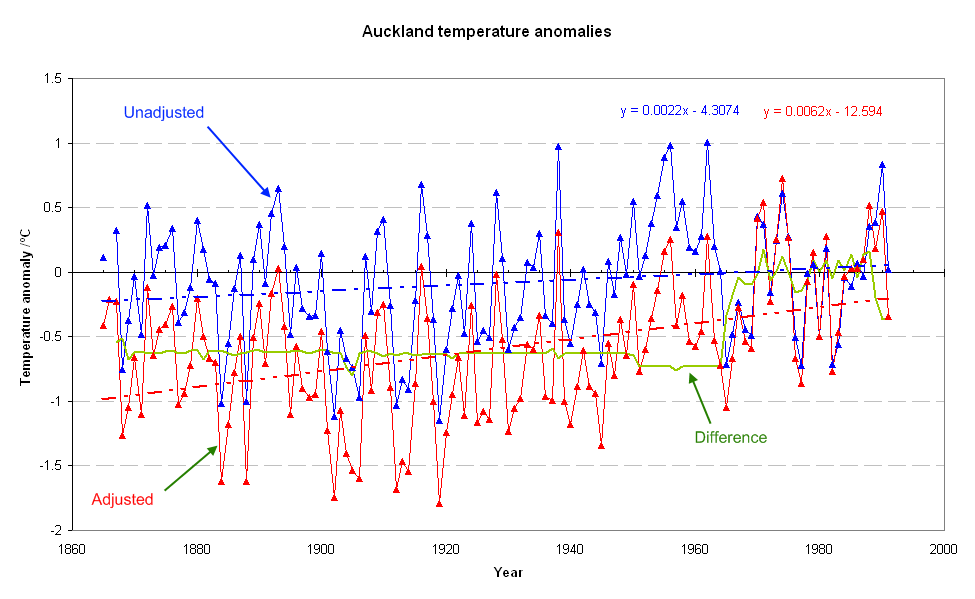
To help visualise what’s happening, here’s the Auckland graph, showing how the original blue trend line becomes the steeper red trend line after the adjustments. All the stations showed this steepening towards warming except for Dunedin, which went mildly the other way. Observe how the adjustments to Auckland (green line) are mostly fairly level but take a big step up in the late 1960s. Remember the data are straight from NIWA — they haven’t been changed.
Go to our paper and have a look at the other graphs in the back of it. It’s interesting to see how the green adjustments line itself has an inexorable rising trend in almost all of them.
I’m not the only one drawing the conclusion that, where losing the worksheets is certainly careless and unprofessional, or at the very least extremely unlucky, selecting adjustments that so clearly introduce a warming trend is not a bit unlucky. There’s no luck involved.
The only way a trend of this magnitude could occur in so many hundreds of data points is for someone to make a deliberate decision to put it there.
Now it’s your turn, NIWA: is there some other reason for the warming trend?
Visits: 93